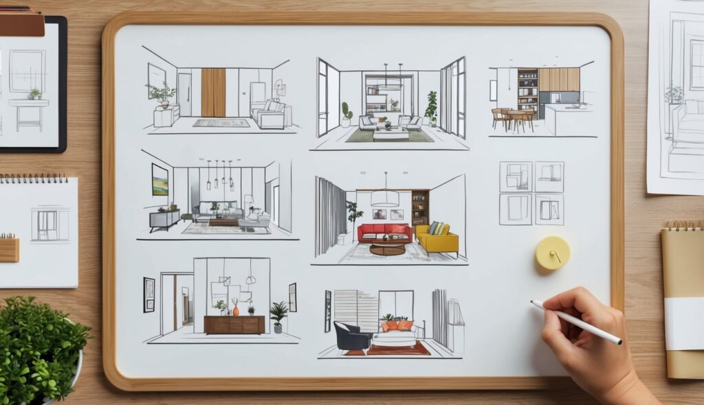
Creating a color palette for architectural designs requires a keen understanding of color theory and its impact on the built environment.
Remember to repin your favorite images!
Balancing primary, secondary, and accent colors ensures a cohesive aesthetic throughout the project.
By using a mix of monochromatic, analogous, and complementary color schemes, architects can enhance both the visual appeal and functionality of a space.
Aesthetics play a significant role in determining the appropriate color palette.
A well-thought-out color scheme can highlight specific architectural features, create a mood, and influence the perception of space.
For example, a neutral base color can ground the design, while bold accent colors can draw attention to focal points.
Design inspiration often comes from a variety of sources, including natural surroundings, cultural elements, and historical contexts.
Color palettes tailored to the specific function of a building can also improve user experience and satisfaction.
Thus, integrating color into architectural design is not just an art but a strategic decision that enhances the overall impact of the structure.
Developing a Color Scheme
Developing a color scheme for architectural designs involves understanding color theory, considering the impact of lighting, and integrating color psychology to achieve the desired atmosphere.
Understanding Color Theory
Color theory is the foundation of creating harmonious color schemes.
It begins with the color wheel, which displays primary colors (red, blue, yellow), secondary colors (green, orange, purple), and tertiary colors (combinations of primary and secondary).
Architects must consider hue, which is the position of the color on the wheel, saturation, which refers to the intensity of the color, and value, which is the lightness or darkness.
Analogous color schemes use colors next to each other on the color wheel, promoting harmony and balance.
Complementary schemes use contrasting colors opposite each other, offering bold, dynamic results.
Monochromatic schemes focus on variations of a single hue, creating a cohesive look.
Different textures and finishes can enhance the selected color palette and influence the perception of color in the space.
Influence of Lighting on Color
Lighting significantly impacts how colors appear in architectural spaces.
Natural light changes throughout the day, altering the hue and saturation of colors.
North-facing rooms may appear cooler, while south-facing spaces often seem warmer due to the sun’s position.
Artificial lighting also plays a key role.
For instance, incandescent bulbs emit a warm light, enhancing reds and yellows, while fluorescent lights often bring out blues and greens.
LED lighting can be customized to various temperatures, offering versatility.
Evaluating paint colors in different lighting conditions is crucial.
Peel and stick paint samples like those offered by Samplize provide an easy way to see how colors will look on-site without the mess of traditional samples.
Color Psychology in Architectural Spaces
Color psychology studies how colors affect emotions, behavior, and mood.
Warm colors like red and orange can create an energetic and stimulating environment, ideal for commercial spaces like restaurants.
Cool colors like blue and green evoke calmness and serenity, making them suitable for healthcare facilities.
Neutral colors provide a timeless backdrop, offering flexibility in design and allowing other architectural elements to stand out.
The right color choices can enhance customer experience in retail spaces, promote productivity in offices, and create a sense of comfort in residential areas.
An architect’s ability to use color psychology effectively can define the success of the space’s intended atmosphere and functionality.
Implementing the Color Palette in Design
Successfully incorporating a color palette into architectural designs involves selecting appropriate materials and textures, using accent colors effectively, and ensuring the interaction between space and structure supports the design vision.
Choosing Materials and Textures
Material selection plays a key role in how colors are perceived.
Concrete, for example, offers a neutral base that can highlight accent colors. When combined with wood textures, it adds warmth and depth.
Using a variety of textures is crucial.
Soft fabrics can make a space feel inviting, while harder surfaces like metal provide contrast.
Architects should consider the balance between different elements to ensure the final design is cohesive.
Selecting materials that complement the color palette enhances the visual interest and supports the overall architectural form.
Examples include using neutral colors for large surfaces and reserving bold colors for smaller, more detailed elements.
Accent Colors and Focal Points
Accent colors are vital for creating focal points.
In interiors, these can be introduced through furniture, artwork, or accessories.
A standout color on a focal wall can draw attention to architectural features or unique structural elements.
When selecting accent colors, it’s important to ensure they complement the primary color scheme.
Too many bold colors can overwhelm the space, while too few can make it bland. The goal is to create balance and harmony.
Incorporating accent colors thoughtfully transforms a space. It highlights critical areas and adds layers of depth, making the design more engaging and dynamic.
Space and Structure Interaction
The way color interacts with space and structure is fundamental to good design.
Colors can alter perceptions of space, making rooms feel larger or more intimate.
Light-colored ceilings, for example, can give the illusion of height, while darker shades can bring them lower.
Structure interaction involves considering how colors work with architectural forms.
Bright accents on structural components like beams or columns can emphasize their shape and importance.
Meanwhile, consistent color schemes across large areas can unify different spaces.
Architects need to consider how the layout and color palette intersect.
This ensures the interior design and architecture are in harmony, resulting in a visually pleasing and functional environment.

