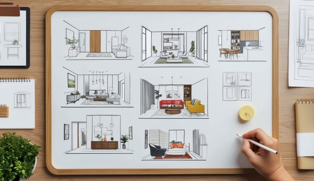
Color plays a crucial role in architectural design, influencing both aesthetics and the emotional impact of a space.
Remember to repin your favorite images!
By carefully selecting paint colors, architects can evoke specific feelings and create unique ambiances within their designs.
For example, red is often used in commercial spaces to convey energy and excitement, while blue can create a calming environment in residential areas.
Different hues and tones can guide the viewer’s eye, adding depth and movement to architectural elements such as walls, floors, and ceilings.
Utilizing resources like Samplize paint samples helps architects ensure that their color choices are both accurate and practical, eliminating the guesswork often associated with traditional paint swatches.
Furthermore, color psychology is essential in understanding how people interact with a space.
The choice of color can impact a person’s mood, behavior, and even their perception of space.
For instance, warm colors can make a large room feel cozier, while cool colors can make small spaces appear more expansive.
Psychological and Emotional Aspects of Color in Architectural Design
Color has a profound impact on both psychological and emotional well-being. The deliberate use of color in architecture can shape moods, influence emotions, and improve the functionality of different settings.
Influence of Color on Mood and Emotions
Certain colors are known to evoke specific emotions and moods.
Blue is often associated with calmness and tranquility, making it suitable for hospitals and healthcare settings.
Red, on the other hand, can stimulate energy and excitement, which is beneficial in spaces designed for physical activity, such as gyms or recreation centers.
Yellow can evoke feelings of happiness and warmth, enhancing creativity and positive emotions. This makes it a popular choice for schools and educational environments.
Green is linked to nature and harmony, promoting relaxation and concentration. Therefore, it is often used in workspaces and offices.
By understanding these associations, designers can create environments that support desired emotional states and mental well-being.
Color and Psychological Functionality in Different Settings
Color can directly impact the functionality of architectural spaces.
In healthcare facilities, calming tones like blue and green can reduce anxiety and promote healing.
Meanwhile, in schools, bright colors like yellow and orange can boost motivation and enhance learning.
Designers must consider the specific needs of each setting when choosing color schemes.
In offices, shades of blue and green can enhance productivity and focus, while warmer tones like red and orange might increase energy but could also lead to feelings of aggression if overused.
Hospitals benefit from soft colors that create a soothing ambiance, aiding patient recovery.
By strategically selecting colors, architects can create environments tailored to the psychological needs of their occupants, promoting well-being and functionality.
The Architectural Significance of Color and Light
Color and light significantly influence architectural design. Both elements contribute to the overall aesthetic, functionality, and sustainability of a space.
Color and Light Interplay in Architecture
The interaction between color and light plays a crucial role in architecture. When integrated thoughtfully, they create a balanced and harmonious environment.
Natural light can highlight the richness of certain colors and add depth, texture, and contrast to surfaces.
For example, a south-facing room painted in warm hues like reds or yellows will appear vibrant and welcoming under ample sunlight.
Artificial lighting also enhances or diminishes colors depending on the type of light sources used.
LED lighting, often employed in modern designs, can replicate natural light, enhancing color accuracy.
Tungsten lighting, on the other hand, casts a warmer tone, making spaces feel cozy.
Proper consideration of light sources is essential for achieving desired visual effects and emotional responses.
Color combinations should be selected based on their interaction with both natural and artificial light to maintain visual coherence.
Sustainability and Energy Considerations
Color and light strongly impact sustainability and energy efficiency in architectural design.
Lighter colors on building exteriors reflect sunlight, reducing heat absorption and lowering cooling costs.
Conversely, darker colors might retain heat, beneficial in cooler climates for reducing heating costs.
The color choices can influence the building’s energy efficiency.
Incorporating natural light reduces reliance on artificial lighting, promoting energy saving.
Design strategies such as large windows and skylights maximize natural light penetration.
Sustainable design also involves using eco-friendly materials that interact positively with light and color.
Integrating energy-efficient lighting solutions and recyclable materials aligns with green design principles.
Effective color and light strategies contribute to creating healthier, more sustainable architecture.

